Have you ever finished a drawing, but it feels like the drawing still lacks something?
Then suddenly a light bulb turns on in your brain as the answer dawns on you: The drawing looks flat and dull!
“Where’s the depth and dimension?” you say to yourself as you wonder what went wrong during the drawing process.
The truth is that the drawing likely never had enough form, depth, and dimension in the first place because the values and shading are off.
The good thing is that this problem is easy to fix. All you need to do is refine your drawing process to achieve smoother and better shading.
As such, this blog post teaches you how to improve your shading skills by teaching you about:
- The importance of layering graphite to build up the values
- Using a wide range of values in your drawings to create contrast
- Why you should spend time studying light and shadow
By the time you’re done reading, you’ll be able to use these strategies to add more life, contrast, depth, and dimension to your drawings to make them more visually appealing.
Table of Contents
1. Build Up the Values with Multiple Layers
One of the main reasons why your shading lacks dynamism and depth is because you aren’t using multiple layers.
Beginner artists often lay down too much graphite when they shade. The problem is that if you lay down too much graphite at once, the graphite is harder to blend.
For example, if you lay down midtones with heavy pressure, it’s harder to blend those midtones into lighter and darker values because you’ve already pushed a lot of the graphite into the paper.
This can make the shading look patchier and less even because you can’t layer graphite as easily on top of them.
As well, putting too much pressure on your pencil creates dark values that look flat and “blocked in.” But if you lay down the black graphite in layers, the dark values appear richer and bolder.
So if you want to create shading that is smooth and flawless, you need to work in layers because it’s one of the best ways to get better at drawing.
Being patient and delaying gratification is worth the wait because your drawing will turn out so much better when you take the time to layer the graphite!
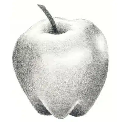
2. Use More Values to Create Contrast
A common reason why your drawing looks flat and dull is because it lacks contrast.
Contrast refers to the difference in the values that you use in an artwork.
For example, artwork with strong contrast uses a wide range of light, medium, and dark values. Conversely, artwork with low contrast uses a limited range of values that look similar to one another.
Take a look at the image below to see an example of a value scale drawn with graphite.
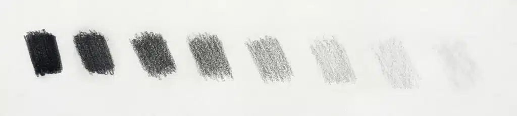
As you can see, one graphite pencil can create a large range of values. Now imagine using two or three graphite pencils in one drawing and consider how many values you can play around with.
That means you should start using darker graphite pencils in the 4B, 6B, 8B, and 10B range. The “B” stands for black.
When beginners learn how to draw, they often feel intimidated by incorporating darker values into their drawings because they’re scared of making mistakes that they fear they can’t fix. In other words, they lack confidence.
However, this mental hurdle is well worth jumping over because once you start adding darker values to your artwork, you can use varying levels contrast in your drawings.
When there’s more variation between the values, the contrast creates greater form, depth, dimension, and dynamism.
3. Study Light and Shadow
If you think your drawings don’t have enough form, volume, depth, or dimension, then you probably need to study light and shadow to better understand how light interacts with subject matter.
Every drawing has a light source and you need to be able to identify where it is in your drawing.
It’s good practice to identify the light source before you start working on your drawing so that you know from which direction the light is shining.
This information is important because it informs where the highlights, midtones, and shadows are in your drawing. After all, changing the position of the light source changes where light and shadow fall on the subject matter.
Here are a few basic concepts you need to know about light and shadow:
- Highlights describe areas that receive direct light
- Reflected light is when light hits a surface and bounces onto the object
- Halftones are neutral, being somewhere between light and dark
- Shadows describe areas that receive little to no light
- The core shadow appears on the darkest part of an object
- The cast shadow is the object’s silhouette that’s cast on a surface
To see images and visual examples relating to these terms, check out this blog post titled A Beginners Guide to Light & Shadow – Part 1 by artist Will Kemp.
Taking time to review these concepts (or learn them if you haven’t done so already) will greatly aid you in your understanding of where to apply light, medium, and dark values.
For your benefit, I’ve created a beginner-friendly drawing tutorial that helps you identify light and shadow on basic 3D forms.
You can check out this easy drawing tutorial in the blog post titled How to Do Easy Sketching for Beginners (4 Awesome Tutorials).
Conclusion: How to Improve Your Shading
In this blog post, you’ve learned about 3 effective tips that teach you how to improve the shading in your drawings.
Improving your shading skills is easier than you think because it’s not about learning new skills, but rather about refining and expanding on the skills you already have.
Now that you’ve finished reading this blog post, I encourage you to take action with your drawings by doing the following:
- Identify one skill that you need help with the most (Layering graphite, using more values, or studying light and shadow)
- Focus on developing and refining that specific skill
- Apply the knew knowledge to multiple drawing studies
- Compare the studies to track your progress and improvement
If you do this consistently, you’ll soon notice improvement in your shading and the quality of your drawings!
Miranda Balogh
Artist & Online Educator


Leave a Reply