You must understand colour theory for artists because it is crucial for every artist’s success.
Colour theory is a set of rules, guidelines, and principles that help artists decide how to use colour effectively in their artwork.
And since humans are visual creatures, the way you use colour in your artwork can make all the difference between selling your art and your art being ignored by the masses.
Thus, it’s important that you learn the fundamentals of colour theory. But how do you get started with tackling such a complex topic?
Well, in today’s article, I’m breaking down the use of colour in art so that you can:
- Understand common terminology including hue, saturation, tint, shade, and other important terms
- Learn about basic colour theory concepts such as colour harmony, colour temperature, and colour relationships
- Understand the role colour psychology can play in your artwork
By the time you’re done reading, you’ll have a solid understanding of colour theory in art and how you can use it to your advantage.
Table of Contents
What is Colour Theory in Art?
In art, colour theory informs an artist’s decision on how to apply colour in their artwork.
By following general guidelines and principles, the artist is able to strategically use colour in aesthetically appealing ways.
Within the field of colour theory, there are several concepts that you should become familiar with, including the following:
- Colour wheel
- Colour temperature (cool and warm colours)
- Colour harmony
- Colour relationships
- Colour mixing
By learning these colour theory concepts, you will have a better understanding of how to use colour theory for artists such as yourself.
For this reason, it is important for an artist to understand colour theory and invest time in learning it, especially if you’re a self-taught artist who hasn’t received formal art training.
After all, the more aesthetically appealing an artwork, the more likely it is to be enjoyed, well-received, or bought.
How do Artists Use Colour Theory?
For starters, you must become familiar with some basic terminology because oftentimes these terms are confused as synonyms when they refer to completely different concepts.
Therefore, understanding the following terms will help you comprehend the many ways in which you can manipulate a colour to appear differently.
So, let’s start with the basics, which including the following terms and their definitions:
- Primary colours: As you probably learned in school, the primary colours are red, blue, and yellow. They are the basic colours from which all other hues are created. It should be noted that primary colours cannot be mixed from any other colours
- Secondary colours: The secondary colours are orange, purple, and green. You can create these colours by mixing red and yellow to produce orange, red and blue to produce purple, and blue and yellow to produce green
- Tertiary colours: These colours are created by mixing a primary colour with a secondary colour. For example, red-orange is created by combining the primary colour red with the secondary colour orange
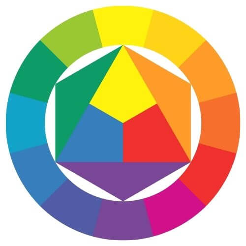
- Hue: It simply refers to the origin of a colour family. For example, the primary and secondary colours (red, orange, yellow, green, blue, and purple) are all hues
- Tint: It is a colour to which white has been added to lighten the colour. For example, pastel colours are tinted colours because white has been added to lighten their pigment
- Tone: It is a colour to which grey has been added. For example, by adding grey to a blue hue, you will create a duller and more washed-out blue with a grey undertone
- Shade: It is a colour to which black has been added. By adding black to a colour, you will darken its pigment
- Value: It is a colour’s range from light to dark. For example, think of a value scale in which a colour is shown in a range from its lightest, palest value to its darkest value
- Saturation: It is the range of a colour from its purest intensity to its greyest value. For example, if the red hue is strong, the colour will appear red. And if the hue is weak, it will appear less pigmented
Now that you understand this basic colour theory terminology, it’s time to have a look at colour harmony.
Principles of Colour Theory: Colour Harmony
Just like illustrators and designers, colour theory for artists includes understanding how to harmonize colours.
In other words, you need to know the many ways in which colours compliment and contrast with one another.
Since colour plays such a huge role in your artwork, it’s not surprising that colours influence your artistic style.
So, let’s begin by reviewing some basic colour harmony principles that you’ve probably already heard of:
- Complimentary colours: These colours are directly opposite one another on the colour wheel. For example, blue and orange are complimentary colours. When used appropriately, these contrasting colours can make each other pop out in an artwork
- Analogous colours: These colours sit next to or close to each other on the colour wheel. For example, analogous colours would include shades of green, blue, and purple. Since they are similar in nature (they’re all cool colours), their qualities harmonize well together
- Monochromatic: This is a colour scheme in which a single hue is used throughout an artwork. The goal is to use various values ranging from light to dark in order to create depth, contrast, and atmosphere. This colour scheme is minimalist in nature and can be a great way to evoke emotion
- Triadic: These colours are found on the colour wheel by looking for a triangular relationship between evenly spaced apart colours. For example, red, blue, and yellow comprise a triadic colour scheme
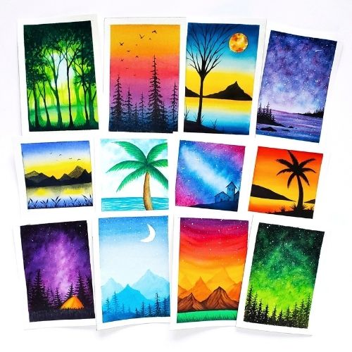
In the collection above, can you identify which paintings use complimentary, analogous, and monochromatic colour schemes?
In order to keep things simplified, we’ll stop here for now because these basic colour harmonies are the first concepts you should master before moving on to more complicated colour combinations.
After all, understanding these basic colour harmonies will help you make better colour choices in your artwork.
So experiment with different colour combinations and decide for yourself which ones appeal to you the most!
After all, experimenting with different colour schemes is a great way to get yourself out of a creative rut.
And don’t worry about more advanced colour theory for now.
Principles of Colour Theory: Colour Temperature
Beginner artists are often unaware of the fact that all colours have temperature. Allow me to explain what that means.
In a nutshell, there are 2 common groups of colours:
- Warm colours including reds, oranges, and yellows
- Cool colours including blues, purples, and greens
But did you know that all colours—whether they be warm or cool—also have colour temperature that can influence them to appear warmer or colder?
It may sound a little confusing at first, but once you understand the basic concept that all colours have warm and cool biases, you’ll begin to realize that it’s actually simpler than you may think.
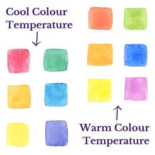
For example, red can have a warm colour temperature, such is the case with the colour pyrrol scarlet. This colour is biased towards orange which gives it a warm tone.
On the other hand, Quinacridone Rose is also a red, but this colour has a cool colour temperature because it is biased towards blue.
When you have a comparison, it becomes easier to visualize the differences and subtle nuances between these colours.
And yet, knowing whether a colour has a warm or cool temperature bias can make all the difference when you’re painting because it will help you learn how to avoid mixing muddy colours.
Note: I highly encourage you to figure out the colour temperature of your paints/pencils/markers. Understanding their individual colour temperature can make such a difference in the way you mix colours.
Principles of Colour Theory: The Psychology of Colour
The psychology of colour is an interesting concept to study because all colours evoke specific emotions or thoughts.
For instance, take a look at the following list to examine the words, emotions, and feelings that are associated with the main colour groups:
- Red: Passion, love, power, passion, anger
- Orange: Confidence, energy, optimism, sociability, naivety
- Yellow: Happiness, warmth, fun, positivity, optimism
- Green: Nature, health, hope, prosperity, safety
- Blue: Wisdom, trust, loyalty, security, sadness
- Purple: Royalty, creativity, spirituality, luxury, sophistication
- Pink: Femininity, sincerity, sweetness, softness, caring
- White: Innocence, peace, purity, simplicity, cleanliness
- Black: Mystery, elegance, formality, dramatic, death
Isn’t it neat to read through the list to observe the associations that we make with each individual colour?
Having this knowledge can be beneficial for an artist because it can help you decide on a particular kind of emotion or atmosphere you might want to invoke in your artwork.
For example, monochromatic artwork makes excellent use of a single colour’s value range to convey emotions to the viewer. Depending on the colour you choose, the meaning behind the artwork can dramatically change.
Therefore, my advice to you is to experiment with these colours the next time you sit down to make art.
Think about your colour choices in terms of what you want the viewer to feel when they interpret your work.
You can read a more thorough breakdown about how artists use colour psychology by checking out this blog post.
Conclusion
And there you have it!
Now that you understand the fundamentals of colour theory for artists, you’ll be able to improve your artwork quickly.
If you have paints, markers, or coloured pencils, I highly encourage you to make your own colour wheel for a few reasons:
- You can use the colour wheel as a visual reference for when you’re struggling to come up with good colour harmonies
- By creating your own colour wheel, you’re putting all the principles from this lesson into action
- Creating colour wheels by scratch will help your brain internalize and memorize the colour theory information you’ve learned today
Don’t worry about advanced colour theory for the time being; it’s enough to just get started with the basic colour theory principles covered in this article.
So have fun, experiment, try out different palettes. With regular practice, I’m sure you’ll become a colour expert in no time!
How do you use colour theory principles in your artwork? Share your thoughts in the comments below!

Miranda Balogh
Artist & Online Educator


I absolutely love this!! As I’ve said before, I’m not an artist, but I love art and photography and learning from you is helping me appreciate art and hopefully making my art/photography a little better! Thanks for sharing!
Thanks, I’m glad you found value in this article! Colour theory also plays an important role in photography, so these tips can definitely apply to your photos.
I always wondered what it’s like to be an artist who paints. This is interesting how much they need to know about colors.
Colour theory influences art in such profound ways. For example, it’s amazing how changing a colour palette can completely alter the way we perceive an artwork.
I remember learning about the primary colors in school but its interesting getting to learn about the warm colors and the cool colors.
Learning about warm vs cool colours can be fun. Especially when you learn about the nuances of colour temperature!
The psychology of color within the color theory is so fascinating! It’s amazing how different companies have used color to help sell more and do their marketing more effectively! Amazon sure didn’t pick that orange color for their buy button on accident!
Your Amazon example is perfect! You’re definitely right that colour psychology plays a huge role in marketing, branding, and sales.
Love this guide! The triadic color concept is particularly interesting – I had never heard of that. I’m going to start thinking about this more when combining colors
Thanks! I’m glad you’ve learned something new from this article.
I didn’t know there’s so much to colors! Thanks for sharing this
You’re welcome!
Not just for artists! This is excellent for those of us entrepreneurs to understand color in working on branding and with graphics. Thank you!
Very true! These colour theory principles can apply to graphic designers, illustrators, marketers, and many other individuals as well.
Very informative post. Love the detail explanations. This great article for creative artist.
Thank you! I’m glad that you found value in this article.
So color theory reminds me of music theory. In that it has a set of rules to be more pleasing to the eyes or in music ears. Never really knew color theory exist, great explanation of it. Very helpful for a person such as myself that is new to painting.
What an interesting comparison! I never thought of it that way, but colour theory and music theory are very similar insofar that they help artists and musicians learn the fundamental rules of each type of theory. Thanks for sharing this observation!
What an awesome introduction to color theory! I don’t consider myself an artist but I found this fascinating all the same!
The great thing is that colour theory can benefit many individuals, not just artists. So I’m glad you still found this article helpful!
What a very thorough guide! So helpful! Thank you for sharing I can see so much work went into this
Thank you! That means a lot.